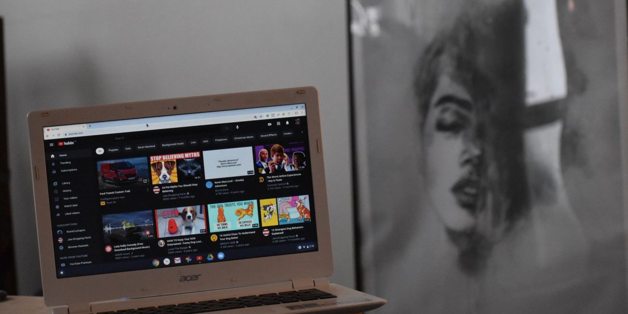
YouTube says a desktop homepage redesign that shows fewer—but larger—thumbnails increased attention and engagement for long‑form videos. For creators and marketers who feared reduced density would hurt discovery, the platform’s own tests point the other way: clearer choices can prompt more viewing.
What YouTube said
Todd Beaupré, YouTube’s Senior Director of Growth and Discovery, told Creator Insider host René Ritchie that the layout change “drove more attention and engagement around long‑form.” He added YouTube ran multiple experiments and would not have launched the change if it reduced viewership, and that the redesign appears to have helped both long‑form and short‑form by making it easier for viewers to decide what to watch.
The interview framed the result around a recurring testing insight at YouTube: more visible options do not always increase consumption. “Sometimes choice is overwhelming and they just don’t choose anything,” Beaupré said, summing up the company’s “often less is more” observation. The interview did not include test statistics such as percentage lifts, sample sizes or timeframes.
Why fewer choices can work
YouTube’s experiments challenge the density‑equals‑discovery intuition. When a homepage displays many small thumbnails, the platform’s hypothesis was that viewers would scan until they found something that appealed. The alternative insight is behavioral: presenting fewer, larger options reduces choice overload and increases the odds that a viewer picks something to watch.
That doesn’t mean every video benefits equally—YouTube described a homepage‑level effect on attention and engagement rather than the impact on individual creators’ homepage impressions.
Timeline and product context
The redesign builds on a broader October 2024 update that introduced larger thumbnails and bigger text among other interface tweaks. Tests of desktop layouts with two or three oversized cards per row were reported in 2024 and again in April 2025; Beaupré’s comment that the change is “coming up on a couple years” aligns with that timeline and confirms the layout has moved beyond isolated experiments in some form. This is distinct from YouTube’s 2019 desktop redesign, which also increased thumbnail size.
YouTube continues to run hundreds of experiments at any given time, and some users will still see layout tests rather than a single universal homepage design.
Practical takeaways for creators and marketers
The core implication is visual: on the desktop homepage, thumbnails that read clearly at larger sizes matter more. Specific actions to prioritise:
- Design for large displays. Use bold composition, a clear focal point and legible text if you include words on thumbnails. Test how your creative reads at desktop dimensions rather than just on mobile.
- Rethink density strategies. If more users are shown fewer cards, chasing sheer impression counts may underperform careful curation and thumbnails that stop scrolling.
- Segment the metrics. YouTube reported aggregate gains for long‑form attention and engagement, not per‑creator homepage impressions. Track homepage impressions, click‑through rate (CTR) and average view duration (AVD) separately to understand where changes are happening.
- Keep running A/B tests. Thumbnails, titles and early watch‑hooks still matter—and outcomes can vary by audience, content type and region. Use short test cycles and treat YouTube’s finding as a directional signal, not a universal rule.
Caveats and what to watch next
YouTube did not disclose the scale, sample or timeframe of the experiments behind its conclusion, so treat the finding as a product signal rather than a guaranteed playbook. Expect continued UX experimentation: a layout you see this week might be a limited test for others.
Practically, the next steps are straightforward: monitor homepage impressions, CTR and watch time for your content; adapt thumbnails to read at larger desktop sizes; and prioritise rapid tests when you spot layout changes. Watch for further announcements or published test data from YouTube, but plan and measure as if the homepage will remain a dynamic, experiment‑driven surface.